Cracker Barrel
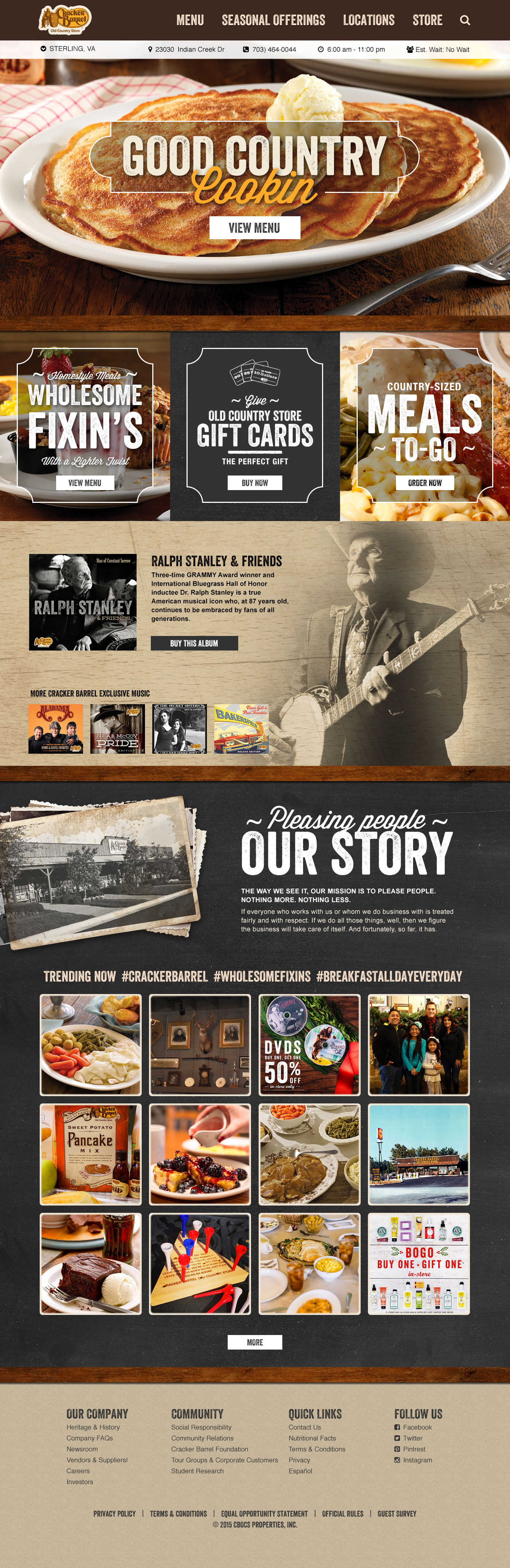
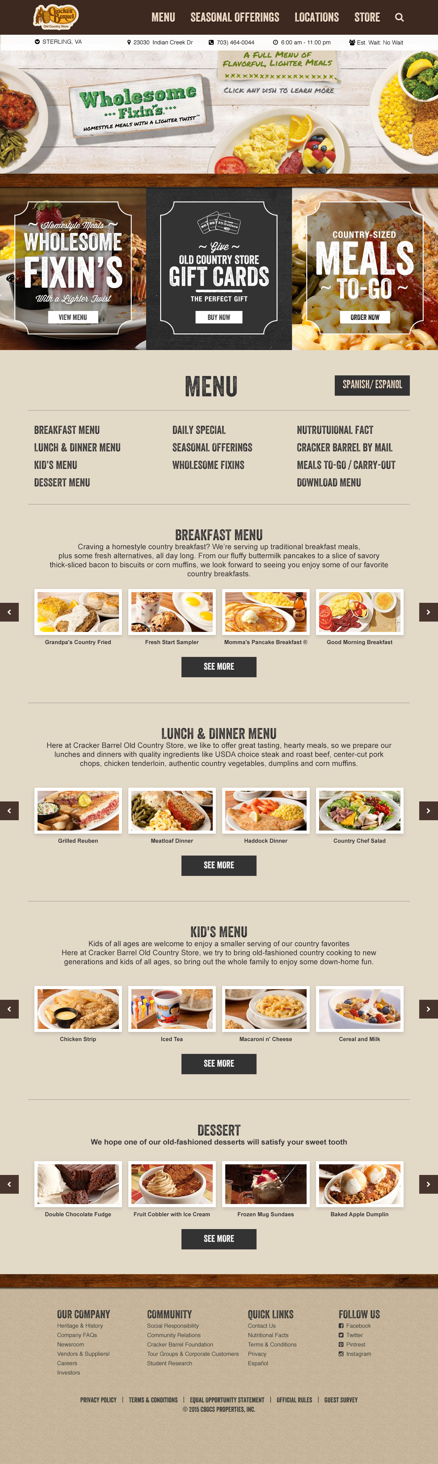
For the redesign of the Cracker Barrel website, the objective was to translate the warmth and charm of the in-store experience into the digital space. The design approach focused on creating an inviting and familiar atmosphere that reflects the character of the brand. A welcoming rustic aesthetic was established through a color palette of natural tones including warm browns, creamy whites, and soft greens. These choices supported the country-inspired design while ensuring readability and accessibility.
A key element of the redesign was the use of high-quality photography to showcase Cracker Barrel’s signature menu items. Prominent imagery of freshly prepared biscuits, skillet breakfasts, and classic comfort food highlighted the brand’s focus on authentic, home-cooked meals and Southern hospitality.
Typography was also carefully considered to reinforce the handcrafted feel of the brand. Playful script fonts were introduced for headers and accents to evoke the look of hand-painted signage and handwritten recipe cards, while clean serif typefaces were used for body copy to maintain readability. Subtle wood textures were incorporated into the background design to echo the interiors of Cracker Barrel’s restaurants.
The result was a modern, accessible, and visually engaging website that successfully extended the nostalgic, welcoming atmosphere of the in-store experience into the digital environment.